Stark Geometries: Brutalist Landing Page Design Principles
While minimal glassmorphism dominates SaaS design, brutalist layouts offer an avant-garde alternative that commands user attention. Our review of the Zenith Apex Brutalist pre-launch template analyzes the mechanics of high-contrast, modernist grid systems.
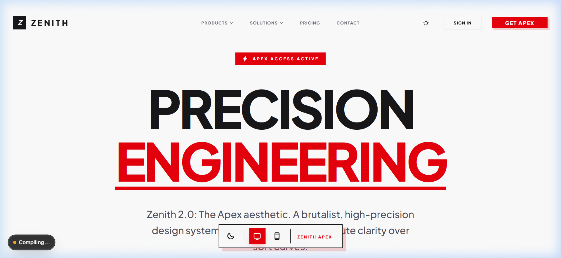
Thick Borders and Stark Grids
The layout rejects smooth gradients in favor of flat backgrounds bounded by solid 2px black borders and 90-degree corners. This creates a bold, structural hierarchy that makes information scanning incredibly simple.
Stark Red Highlights
To guide user attention, the template uses bright red highlights against deep charcoal backgrounds. This high-contrast palette ensures interactive elements like pricing boxes and waitlist buttons are immediately identifiable, driving strong pre-launch conversions.
Teardown Curation Matrix
| Product Curation | Performance | Price | Focus Niche | Acquisition |
|---|---|---|---|---|
| Zenith Apex Brutalist Page | 100/100 | $19 | Landing Pages | View Spec |
Zenith Apex Brutalist Page
A bold, brutalist-style pre-launch page engineered with high-contrast custom typography, stark red highlights, and geometric bento pricing boxes.
Starting At
$19